Understanding the Link Between Paint Color and Mood
Have you ever walked into a room and felt an immediate shift in your mood? Maybe it was the earthy greens that connected you to nature or the calming blues that made you feel at ease. The phenomenon isn’t just in your head; it’s the magic of color psychology at play. In this article, we will dive deep into how paint colors influence our emotions, the science behind it, and how you can harness this knowledge to transform your spaces.
Color Psychology: The Basics
Color psychology is the study of how colors affect perceptions and behaviors. Imagine it like a cocktail: each color is an ingredient, and when mixed together, they create different emotional effects. For example, while red might stir up passion and excitement, blue tends to foster calmness and reflection. This concept has been around for centuries and is not just relevant in art and design; it also has implications in marketing, fashion, and even workplace productivity.
The Science of Color Perception
From a scientific standpoint, colors are wavelengths of light that our eyes perceive. Each color has its own wavelength, and these wavelengths can evoke responses from us on both a physiological and psychological level. For example, warm colors like red, orange, and yellow often increase heart rates and stimulate feelings of warmth and energy. In contrast, cooler colors such as blue, green, and purple tend to lower heart rates and create a tranquil atmosphere.
The Emotional Spectrum of Colors
- Red: Excitement, passion, and urgency
- Blue: Calm, trust, and stability
- Green: Growth, harmony, and balance
- Yellow: Happiness, optimism, and energy
- Purple: Luxury, creativity, and wisdom
- Orange: Enthusiasm, vitality, and friendliness
- Brown: Stability, reliability, and comfort
- Black: Power, elegance, and sophistication
- White: Purity, cleanliness, and simplicity
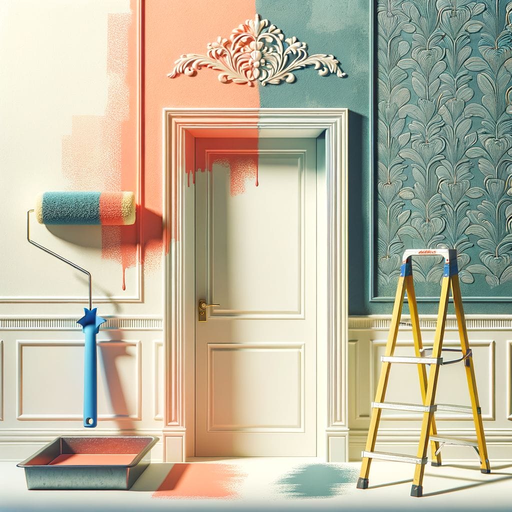
Why Does Paint Color Matter?
When we paint a room, we aren’t just changing its appearance; we’re also altering the mood and feeling of the space. Think of your home as a canvas, and each color you choose tells a different story. This is especially significant because our environments can heavily influence our daily experiences. The right colors can invigorate you in the morning or help you wind down at night.
Paint Color and Mood in Different Spaces
Living Rooms: The Heart of the Home
Your living room is where memories are made, laughter resonates, and comfort is sought. Choosing the right color can create the desired atmosphere. Soft blues, for instance, invite conversation and connectivity, while warm neutrals add a cozy feel. Are you a fan of hosting gatherings? Consider energizing yellows or rich oranges to spark joy and enthusiasm among your guests!
Bedrooms: Your Personal Sanctuary
Ah, the bedroom—a haven for rest and rejuvenation. What colors are best for promoting relaxation? Calming colors like soft blues, muted greens, and gentle lavenders can create a serene environment that encourages restful sleep. You could say that these colors act like a lullaby for your walls, soothing your spirit after a long day.
Kitchens: The Kitchen Connection
If the living room is the heart, then surely the kitchen is the soul of the home. This is where we gather to whip up meals and share stories. Warm yellows and fresh greens can stimulate appetite and conversation, making your kitchen a lively place! What do you want to feel as you cook or enjoy a meal? Smooth tones of white or cream can exude cleanliness, while vibrant accents can make cooking feel like a delightful adventure.
Home Offices: Productivity and Creativity
Creating a productive home office setting is crucial for focus and creativity. Cool colors like teal or soothing green can stimulate creative thinking, while a pop of orange can ignite motivation. Think of your home office as a launchpad for your ideas—what colors do you think would best fuel your imagination?
How to Choose the Right Color for Your Space
Choosing a paint color isn’t just about picking something pretty. It’s about creating emotional resonance in your space. Here are some steps to guide your decision-making:
1. Define the Purpose of Each Room
What do you want to achieve with each space? Whether it’s calm and tranquil or vibrant and stimulating, having a clear purpose can steer your color choices in the right direction.
2. Consider Natural Light
The amount of natural light a room receives can significantly affect how a color appears. Lighter colors can make a small room feel more expansive, while darker hues can create coziness. Don’t forget to test paint samples in different lighting conditions, too!
3. Think About Room Size
Small spaces may benefit from lighter colors, which can enhance the illusion of space. On the other hand, larger rooms can handle bolder shades, which can make them feel more intimate.
4. Create Color Harmony
Don’t just pick colors in isolation; consider how they will work with existing furniture and decor. A cohesive palette can create a comfortable flow throughout your home.
Bold Choices vs. Subtle Shades
Some people thrive on bold color choices, while others prefer subtlety and nuance. There’s artistry in both approaches, isn’t there? A bright accent wall can energize a space, while soft colors create a serene background that supports your furnishings and decor. What speaks to you?
The Role of Accent Walls
Accent walls can be a game-changer. They allow you to make a statement without overwhelming the entire room. However, be mindful of the color you choose; it should complement the overall mood you desire. If you want a cheerful vibe, a bright yellow accent wall could work wonders!
Trends in Color Psychology
As trends change, so do people’s perceptions and emotions associated with colors. In recent years, we’ve seen a rise in earthy tones and organic shades, reminiscent of nature, making us feel grounded and connected. Additionally, biophilic design—where natural elements are incorporated into spaces—is becoming more popular. It’s a beautiful marriage of color and mood, isn’t it?
The Impact of Seasons on Color Choices
Seasons play a significant role in our mood, and the colors we choose can reflect those changes. Spring may inspire lively greens and florals, while winter typically leans towards earthy hues or rich jewel tones. Seasonal colors can mirror how you want to feel throughout the year.
Color Maintenance and Longevity
Once you’ve chosen your color, consider maintenance. Lighter colors may show dirt and wear more easily, while darker colors can fade in direct sunlight. Your choice isn’t just an aesthetic one; it’s a commitment. How often are you willing to repaint or touch up? Knowing this can help guide your color selections.
Top Paint Brands and Their Color Innovations
It’s essential to explore various paint brands as they often introduce innovative colors and finishes that can inspire your choices. Brands like Sherwin-Williams, Benjamin Moore, and Behr regularly release color forecasts that highlight emerging trends. These companies often provide helpful tools to visualize how different colors will look in your space, which can be invaluable.
Conclusion
As we wrap up our colorful journey, we’ve seen how paint colors can profoundly impact mood and space. Whether you’re looking to create an energizing environment or a calming sanctuary, understanding the psychological effects of colors can guide you in making informed choices. Remember, your home is your canvas, and the colors you choose are the brushstrokes that define your unique story. So, what color will you choose to tell yours?
FAQs
- Does paint color affect productivity in a home office? Yes, colors such as blue and green can stimulate creativity and focus, making them great choices for home office spaces.
- What is the most calming color for a bedroom? Soft blues and muted greens are often considered the most calming colors, promoting relaxation and restful sleep.
- Can accent colors affect the mood of a room? Absolutely! Accent colors can enhance or change the mood of a space depending on their vibrancy and saturation.
- How can I test paint colors before committing? You can purchase sample sizes and paint swatches on your wall to see how they look in different lighting conditions before finalizing your choice.
- Are there colors that should be avoided in certain spaces? Bright, aggressive colors like neon shades may be overwhelming in a bedroom or a small space, while overly muted colors may not uplift energetic areas like kitchens or living rooms.